The purpose of this topic is to provide basic understanding of charting terminology and how pivot charts are used in data analysis.
Charts are composed of various elements such as chart areas, series, legends, titles, axes, walls, etc. that are illustrated by the following image:
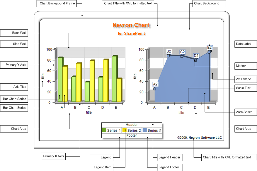
There is a certain hierarchy associated with chart elements - i.e. some chart elements are contained in other chart elements - for example the chart walls and axes are parts of each charting area, the legend header and footer are parts of the legend etc. There are three root elements that define the overall chart layout - Chart Areas, Legends and Titles (see Chart Panels for more info).
A Charting Type is associated with each charting area. The charting type defines the geometrical figures and logic that is used to display a collection of values - in charting terminology called Series. In the image above you can see three series - Series 1 and Series 2 are plotted on the first chart area as a cluster bar chart, and Series 3 are plotted on the second chart area as an area chart. All three series are annotated on a single legend.
It is important to know that a series contains a set of data points that are extracted from your data. A data point can contain multiple values - in the example above Series 1 and Series 2 (bars) need only 1 value for each data point to be displayed, but Series 2 (area) needs two values - a numeric value for the data point elevation and a string value for the data point label.
We assume that you are in chart web part design mode. See the
Adding the WebParts to Pages for a complete discussion on how to add the web part to a page and run the chart designer.
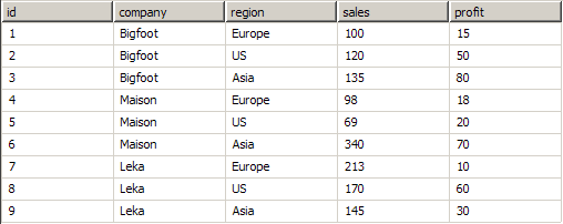
The first step in making a chart is to connect it to a data source - the Connecting to Data topic will guide you through this process. A data source is generally a table with rows and columns. The values in each column are in most cases of the same type (e.g. numbers, texts, date-times etc.).
Lets assume that you have connected to this data source:
By default the Nevron Chart for SharePoint is configured to have one charting area with cluster column chart, so we will now investigate the possibilities to display the data source. Generally, there are two strategies:
1. Tabular View - use this approach to display a data point for each record.
For example: to create a bar for each row sales value, that has categorical labels with the company names - do the following:
- Go to the Pivot page
- Go to Data Groupings > Values page
- Drag and Drop the sales field on the Drop Value Fields Here spot.
- In the General > Data > Value field type: =Fields!sales
- Go the Data Groupings > Categories page
- click on the Add Category button (to create a new category)
- click on the Add Group By button and type: =Fields![RowIndex]
- in the Label text box type: =Fields!company
When you click the Preview page the following chart will show:
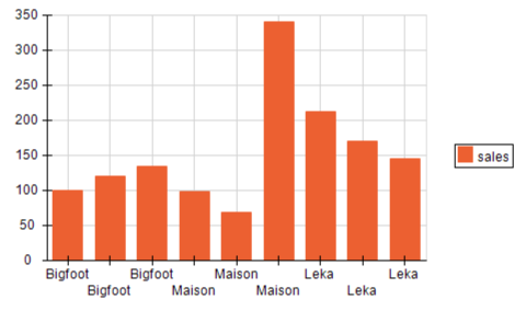
Q. What have we done?
A. We have created a single category that creates a group for each record of the data source. The category label is extracted from the company column. The bars values are extracted from the sales column.
Q. When to use?
A. When the data is already aggregated (e.g. if you use a SELECT statement with a GROUP BY clause), or when you want to explicitly show each row.
2. Matrix View - use this approach to display summary values.
For example: to create a bar for each company total sales value, that has categorical labels with the company names - do the following:
-
Go to the Pivot page
-
Go to Data Groupings > Values page
- Drag and Drop the sales field on the Drop Value Fields Here spot.
-
Go to Data Groupings > Values page
- Drag and Drop the company field on the Drop Category Fields Here spot.
When you click the Preview page the following chart will show:
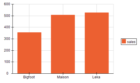
Q. What have we done?
A. We have created a single category that creates a group for all records that belong to a single company. The category label is extracted from the company column. The bars values are calculated as the sum of all sales for the company group records.
Q. When to use?
A. When the data is not aggregated and you want to:
- Summarize a large quantity of data into a smaller, more condensed and readable chart. Even in our basic sample we reduced the data points count three times - thus increasing readability.
- Help identify relationships/trends within your data that would otherwise be hard to see due to its quantity. Even in our basic sample the tabular view fails to provide a clear visual perception for which is the company with most total sales. What about - Which is the best selling region? Which is the best performing company-region? What is the average profit per company and/or region? - pivot charts give a visual answer to these and many other strategic/performance questions.
For the purpose of simplicity, we have only scratched the surface of pivot charting. You should however know that even a simple dataset can have multiple types of matrix views, each "slicing and dicing" it in very diverse ways. These views will visually give the answers to very complex questions, that will otherwise remain hidden in stockpiles of data.