In This Topic
The web parts in the Nevron Vision for SharePoint support rich formatted texts with many advanced options. Rich formatted texts are strings, in which you use XML tags to define the appearance of the contained substrings. The XML formatted texts closely follows the common HTML formatting tags and even adds some advanced features like support for fill styles, stroke, shadows and image filters, which are not supported by HTML.
It is important to follow the XML formatting rules when writing XML formatted texts, which slightly differ from HTML formatting. The most important difference is that you must always close each tag that you open and that all tags must be nested in each other (you cannot have overlapping tags).
When XML formatted text is parsed its initial state for font style, fill style, border style and shadow style are defined by the Text Style associated with that text. Therefore it is recommended to use default settings, which closely match the default text properties of the displayed text in order to minimize the amount of the XML formatted text and thus to improve performance.
The tag controlling the font style is naturally the well known HTML <font> tag, which accepts several font attributes, which we'll discuss in detail in the following paragraphs. The tag inserting a new line is the natural <\br> tag, which needs no further explanation.
Following is a detailed explanation of the different font attributes and additional tags.
Font Face and Size Attributes
The font face and font size attributes allow you to modify the font name and size respectively used to render the text enclosed in the font start and end tags. For example:
<font face='Tahoma' size='19'>TAHOMA FONT</font>
<font face='Impact' size='22'>IMPACT FONT</font>
will display the following text:

The font color attribute changes the color used to draw the text enclosed in the font start and end tags. For example:
<font face = 'Tahoma' size = '19' color = 'red'> TAHOMA FONT </font>
<font face = 'Impact' size = '22' color = 'blue'> IMPACT FONT </font>
will display the following text:

you can also use RGB values when specifying the font color:
<font face = 'Tahoma' size = '19' color = '#FF0000'>TAHOMA FONT</font>
<font face = 'Impact' size = '22' color = '#0000FF'>IMPACT FONT</font>
Font Gradient Attribute
The font gradient attribute allows you to specify a gradient fill style on the text enclosed in the font start and end tags. The following example applies horizontal and vertical gradients to the 'TAHOMA FONT' and 'IMPACT FONT' texts:
<font face = 'Tahoma' size = '19' gradient = '0, 0, white, red'>TAHOMA FONT</font>
<font face = 'Impact' size = '22' gradient = '0, 0, white, blue'>IMPACT FONT</font>
displays the following text:

Font Hatch Attribute
The font hatch attribute allows you to specify a hatch fill effect on the text enclosed in the font start and end tags. The following example applies checkerboard and cross hatch styles on the 'TAHOMA FONT' and 'IMPACT FONT' texts:
<font face = 'Tahoma' size = '19' hatch = 'largecheckerboard, white, red'>TAHOMA FONT</font>
<font face = 'Impact' size = '22' pattern = 'cross, white, blue'>IMPACT FONT</font>
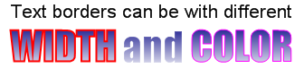
Font Border Attributes
You can modify the border (outline) of the font by using the border, bordercolor, borderpattern, and borderfactor attributes. Their meaning is the same as the Width, Color, Pattern and Factor settings of the Stroke Style Editor. The following XML will render text with different border width and color:
Text borders can be with different<\br>
<font face = 'Impact' gradient = '0, 1, White, Navy' size = '33'>
<font border = '2' bordercolor = 'red'>
WIDTH
</font>
and
<font bordercolor = 'magenta' border = '1'>
COLOR
</font>
</font>
displays the following text:
Font Background Fill and Border
By default all text fragments do not have a background. You can modify the text background in the same way as with the text foreground settings (using the color, gradient, hatch and border attributes). The only difference is that you need to prefix these attributes with "back-". The following XML defines a white blue text on a white to gray background:
Following is <font color = 'lightgreen' back-gradient = '0, 0, lightgray, black'>Green Text on White to Gray Background</font>

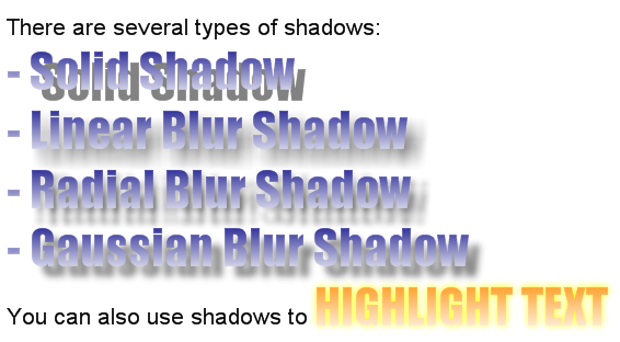
Font Shadow Attributes
You can modify the shadow dropped by the font by using the shadowtype, shadowfadelength, shadowoffset and shadowcolor attributes. Their meaning as the same as the Type, Fade Length, Offset and Color settings found in the .
The following XML formatted text shows how to work with shadows:
There are several types of shadows:<br></br>
<font shadowoffset = '10, 10' shadowfadelength = '10' face = 'Impact' gradient = '0, 1, White, Navy' size = '33'>
-
<font shadowtype = 'solid'>Solid Shadow</font><br></br>
-
<font shadowtype = 'linearblur'>Linear Blur Shadow</font><br></br>
-
<font shadowtype = 'radialblur'>Radial Blur Shadow</font><br></br>
-
<font shadowtype ='gaussianblur'> Gaussian Blur Shadow </font><br></br>
</font>
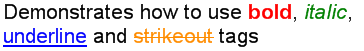
Font Style Control
Almost every HTML author is familiar with the HTML <B>, <I>, <U> and <STRIKE> tags (font style modifiers). The nice thing about these HTML tags is that they modify the base font style without much typing, which also increases the readability of the XML text. Nevron Chart for SharePoint supports all of them, but you must keep in mind that this is XML after all so you must always close the opening style modifier tag. The following text shows how to work with font style modifiers:
Demonstrates how to use
<font color = 'red'><b>bold</b></font>
, <font color = 'green'><i>italic</i></font>
, <br><font color = 'blue'><u>underline</u></font>
and <font color = 'darkorange'><strike>strikeout</strike></font>
tags
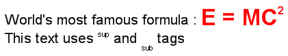
Superscript and Subscript
One of the common tasks when displaying text is that sometimes you have to use subscript or superscript texts. These types of texts are necessary when writing mathematical formulas or when you have some other type of text that should not be placed on the text baseline (like author notes). The text rendering in XML mode supports subscript <sub> and superscript <sup> tags. These tags alter the font size and baseline automatically depending on current font. Note that you can also have nested <sub> and <sup> tags.
The following text shows how to display the famous Einstein formula: E = MC2
World's most famous formula :
<font size = '25' color = 'red'>
<b>E = MC<sup>2</sup></b>
</font>
<br>
This text uses <sup>sup</sup> and
<sub>sub</sub> tags
This results in the following rendered text:
Bullets and Numbering
Sometimes when writing text it is often necessary to have automatic numbering or simply a visual tip helping the end user to better comprehend the text. In such cases you can take advantage of the built-in bullet and bullet numbering features of the XML formatted text. As you might guess bullets are controlled with the <UL> and <LI> tags like in HTML. Nevron Chart for SharePoint supports nine types of bullets as follows:
| Bullet type |
Description |
| None |
No bullet only text indent |
| Disk |
Circle bullet |
| Star |
Star bullet |
| Square |
Square bullet |
| Decimal |
Bullet with text decimal numbering starting from 1. For example 1, 2, 3, 4 etc. |
| LowerRoman |
Bullet with lowercase text Roman numbering starting from i. For example i, ii, iii, iv etc. |
| UpperRoman |
Bullet with uppercase text Roman numbering starting from I. For example I, II, III, IV etc. |
| LowerAlpha |
Bullet with lowercase text alpha numbering starting from a. For example a, b, c, d etc. |
| UpperAlpha |
Bullet with uppercase text alpha numbering staring form A. For example A, B, C, D etc. |
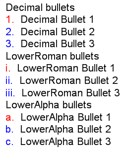
You control the bullet style by changing the liststyletype attribute of the <UL> tag. All bullets enclosed in this tag share this list style type. The following text shows how to create bulleted text:
Decimal bullets
<ul liststyletype = 'Decimal'>
<li color = 'red'> Decimal Bullet 1 </li>
<li color = 'blue'> Decimal Bullet 2 </li>
<li color = 'blue'> Decimal Bullet 3 </li>
</ul><br/>
LowerRoman bullets
<ul liststyletype = 'LowerRoman'>
<li color = 'red'> LowerRoman Bullet 1 </li>
<li color = 'blue'> LowerRoman Bullet 2 </li>
<li color = 'blue'> LowerRoman Bullet 3 </li>
</ul><br/>
LowerAlpha bullets
<ul liststyletype = 'LowerAlpha'>
<li color = 'red'> LowerAlpha Bullet 1 </li>
<li color = 'blue'> LowerAlpha Bullet 2 </li>
<li color = 'blue'> LowerAlpha Bullet 3 </li>
</ul>
This XML results in the following text rendered by the control:
Shapes
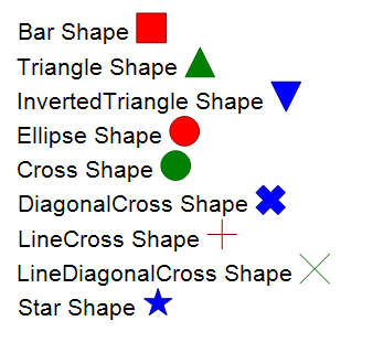
The XML formatted texts support simple shapes that can be nested inside the rendered text. The following XML fragment shows how to display text with simple shapes:
Bar Shape <shape shape='bar' size = '20pt, 20pt' color = 'Red' bordercolor = 'DarkRed'/><br/>
Triangle Shape <shape shape='triangle' size = '20pt, 20pt' color = 'Green' bordercolor = 'DarkGreen'/><br/>
InvertedTriangle Shape <shape shape='invertedtriangle' size = '20pt, 20pt' color = 'Blue' bordercolor = 'DarkBlue'/><br/>
Ellipse Shape <shape shape='ellipse' size = '20pt, 20pt' color = 'Red' bordercolor = 'DarkRed'/><br/>
Cross Shape <shape shape='cross' size = '20pt, 20pt' color = 'Green' bordercolor = 'DarkGreen'/><br/>
DiagonalCross Shape <shape shape='diagonalcross' size = '20pt, 20pt' color = 'Blue' bordercolor = 'DarkBlue'/><br/>
LineCross Shape <shape shape='linecross' size = '20pt, 20pt' color = 'Red' bordercolor = 'DarkRed'/><br/>
LineDiagonalCross Shape <shape shape='linediagonalcross' size = '20pt, 20pt' color = 'Green' bordercolor = 'DarkGreen'/><br/>
Star Shape <shape shape='star' size = '20pt, 20pt' color = 'Blue' bordercolor = 'DarkBlue'/><br/>