My First Dashboard in SharePoint
In This Topic
Following is an example dashboard that goes through the planning and implementation phases, described in the Dashboards - Getting Started topic.
Planning Phase
1. Which are the data sources and what is their schema?
For this sample we are going to use the following fictional data source:
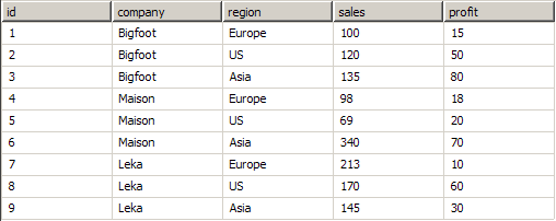
2. What data analysis must be performed on the data?
For this sample we want to make a dashboard, which shows the grouped company sales for a specific region. We want to allow the user to specify a blank region in the case of which the report will be for all regions.
3. What display elements are needed to show the data analysis?
For this sample we will need a bar chart, the categories of which are the companies and the bar values are the sum of sales for the selected region.
4. What parameters are needed and where and how are they used?
We would need one parameter - for the selected region. The parameter fill be used to filter out the records that apply only to the selected region.
Implementation Phase (using SharePoint Filter WebParts)
- Add a new Choice Filter Web Part to an arbitrary SharePoint page.
- Configure it like this:
Filter Name: RegionName
Options: US Europe Asia (each on new line)
Show Empty Value: check it
Default Value: US
- Add a chart web part to the page (see Adding the WebParts to Pages for more info).
- From the Choice Filter Web Part Edit Menu, choose Connections > Send Filter Values To > Nevron Chart for SharePoint
- Run the Chart Designer
- Go to the Chart > Pivot page
- Drag and drop the sales field as values data grouping.
- Drag and drop the company field as category data grouping.
- Add a new pivot filter (from the Filters tab next the Data Groupings tab) with the following expression:
=IF(Params!SPF_RegionName.STR = "", true, Fields!Region = Params!SPF_RegionName.STR)
-
Click the chart designer OK button to save the made changes and return to the page.
Now you have an interactive dashboard, which allows you to choose a region and displays the companies sales for the selected region. Initially selected is the US region.
Implementation Phase (using Nevron JavaScript API):
- Add a chart web part to an arbitrary SharePoint page (see Adding the WebParts to Pages for more info).
- Run the chart designer.
- Connect the chart web part to the data source. (see Connecting to a Database for more info).
- Go to the Chart > Pivot page
- Drag and drop the sales field as values data grouping.
- Drag and drop the company field as category data grouping.
- Add a new pivot filter (from the Filters tab next the Data Groupings tab) with the following expression:
=IF(Params!RegionName.STR = "", true, Fields!Region = Params!RegionName.STR)
- Click the chart designer OK button to save the made changes and return to the page.
- Add a new Content Editor Web part and insert the following HTML + Java Script:
| HTML and JavaScript |
Copy Code
|
<table>
    <tbody>
        <tr>
            <td>Region Name:</td>
            <td>
                <div id="NRegionNameId"></div>
            </td>
        </tr>
    </tbody>
</table>
<script type="text/javascript">
    NInitSTRParam("NRegionNameId", "RegionName", {
        InitialValue: "US",
        RefreshMode: "auto",
        EnumValues: new Array("", "US", "Europe", "Asia")
    });
</script>
|
Now you have an interactive dashboard, which allows you to choose a region and displays the companies sales for the selected region. Initially selected is the US region.
For the purpose of simplicity we have chosen to implement a very simple parameterization scenario, which dynamically modifies a pivot filter. Since parameters can be consumed by almost all web part properties, including the properties that define the data source connection, you can actually parametrize almost everything in the Nevron SharePoint Vision web parts (more specifically every property that has an FX button).
If you want to build a custom dashboard in SharePoint and do not want to bother doing that yourself - contact Nevron Consulting at consulting@nevron.com for a quote.