Nevron Vision for SharePoint Documentation
Editors / Appearance FX Editors / Fill Style FX Editor
In This Topic
    Fill Style FX Editor
    In This Topic

    The Fill Style FX Editor provides visual editing of the properties, that let you define a filling, based on a mixture of constant property values and expressions. It is shown when you click the FX Button of a fill property editor.

    Following is a description of its properties:

    Automatic - specifies whether the fill style is automatically determined. If this check is checked the entire fill style editor will be disabled. Uncheck this check if you want to provide a local fill style value.

    Fill Style - defines the style of filling to use. Possible values are Color, Gradient and Hatch.

    Color - defines the primary color of the filling. Used by all fill styles.

    Secondary Color - defines the secondary color of the filling. Used only in case of a Gradient or Hatch fill style.

    Gradient Style - defines the style of the gradient to use. Only applicable if Gradient is selected as a Fill Style. See Gradient_Styles_Table for a visual preview.

    Hatch Style - defines the style of the hatch to use. Only applicable if Hatch is selected as a Fill Style. See Hatch_Styles_Table for a visual preview
     Gradient Styles Table

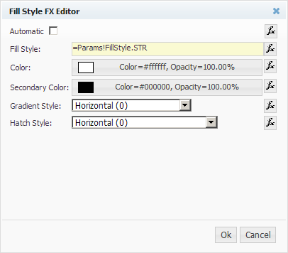
    The following table summarizes the possible Gradient Style options (for Color=White and Secondary Color=Black):

    Gradient Style Preview Gradient Style Preview Gradient Style Preview
    Horizontal Diagonal Up Left Top Corner
    Horizontal Center Diagonal Up Center Left Bottom Corner
    Vertical Diagonal Down  Right Top Corner
    Vertical Center Diagonal Down Center Right Bottom Corner
    Center Start To End
    (preview shown, when start is top side and end is bottom side - see note)
    Start To End Center
    (preview shown, when start is top side and end is bottom side - see note)

    Certain elements (like Gauge Ranges) take into account the Start To End gradient style setting and bend Start To End gradients along their geometry. Elements that do not have directional geometry fallback to Horizontal modes.

     Hatch Styles Table

    The following table summarizes the possible Hatch Style options (for Color=White and Secondary Color=Black):

    Pattern Style Preview Pattern Style Preview Pattern Style Preview
    Percent 5 Wide Downward Diagonal Diagonal Brick
    Percent 10 Wide Upward Diagonal Horizontal Brick
    Percent 20 Light Vertical Weave
    Percent 25 Light Horizontal Plaid
    Percent 30 Narrow Vertical Divot
    Percent 40 Narrow Horizontal Dotted Grid
    Percent 50 Dark Vertical Dotted Diamond
    Percent 60 Dark Horizontal Shingle
    Percent 70 Dashed Downward Diagonal Trellis
    Percent 75 Dashed Upward Diagonal Sphere
    Percent 80 Dashed Horizontal Small Grid
    Percent 90 Dashed Vertical Large Grid
    Light Downward Diagonal Small Confetti Small Checker Board
    Light Upward Diagonal Large Confetti Large Checker Board
    Dark Downward Diagonal Zig Zag Outlined Diamond
    Dark Upward Diagonal Wave Solid Diamond